
When it comes to indulging in the latest home design trends, it can be tricky to find a balance around what colors and styles to heavily invest in. Every year there are so many eye-catching shades and textures that surge in popularity that it’s hard to resist not using all of them! A great place to start when choosing your home decor color scheme is with your room’s actual foundation: your fabulous flooring.
If you’re in the market for new surfaces, you can make purchase decisions based on which flooring will help you capture either your favorite vibe or is likely to match multiple different schemes down the line. You can also play off of your current flooring to compliment your favorite trending color palette in savvy ways both bold and subtle. Here are a few of our favorite color combinations that will deliver smashing results:

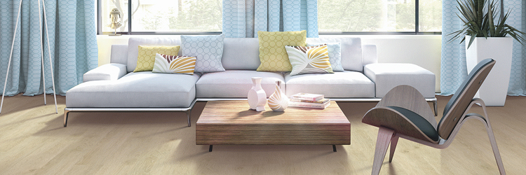
Inspired Color Palettes - In 2020, we can expect to see airy shades gaining more popularity to bring in the light. The goal of many flooring and paint combinations will be to provide peace and tranquility and bring new life to old rooms. Pastel shades of pink, yellow, baby blue and mint green are going to thrive whether used to contrast darker colored flooring, neutral gray walls or crisp white trim.
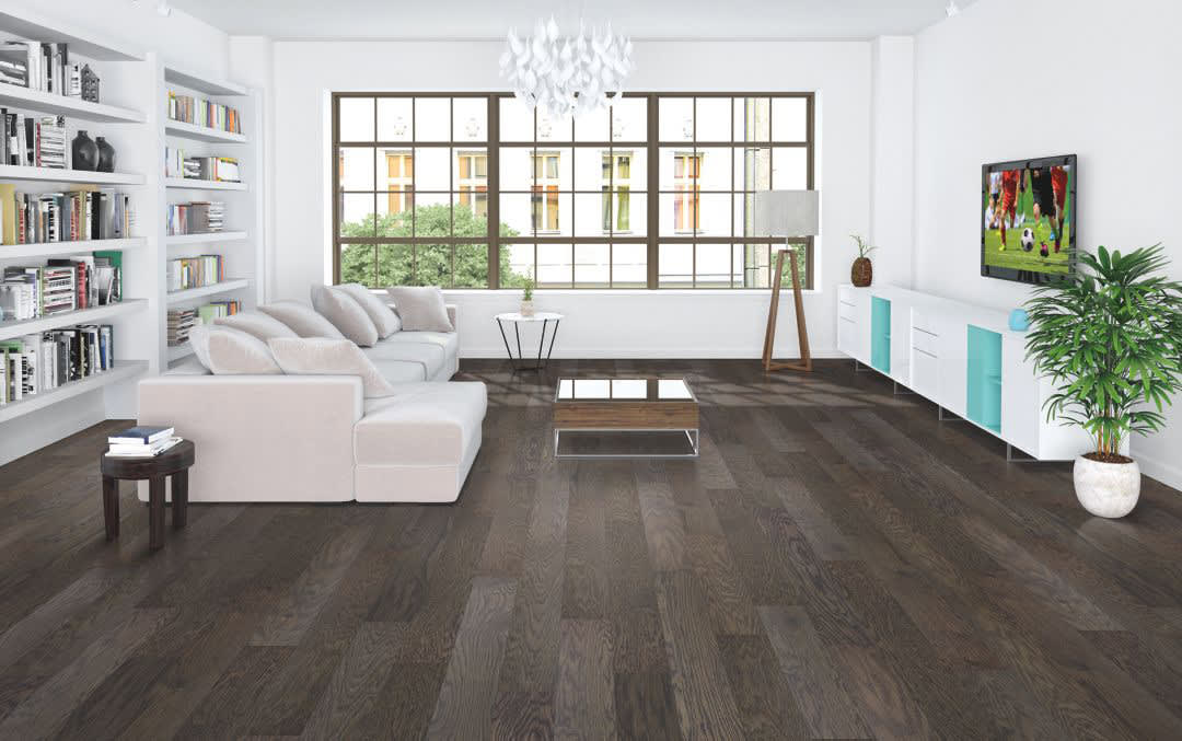
Rich Hardwood Beauty - When it comes to darker wood flooring colors, you can use the pastel color palette to brighten up the room. This applies to all hard surface options including wood-look LVT and tile as well. Light pink or mint green walls, or just one wall, will be bold but not overbearing. You can also add these balanced shades with an upholstered chair, throw pillows or drapes if you don’t want to re-paint.
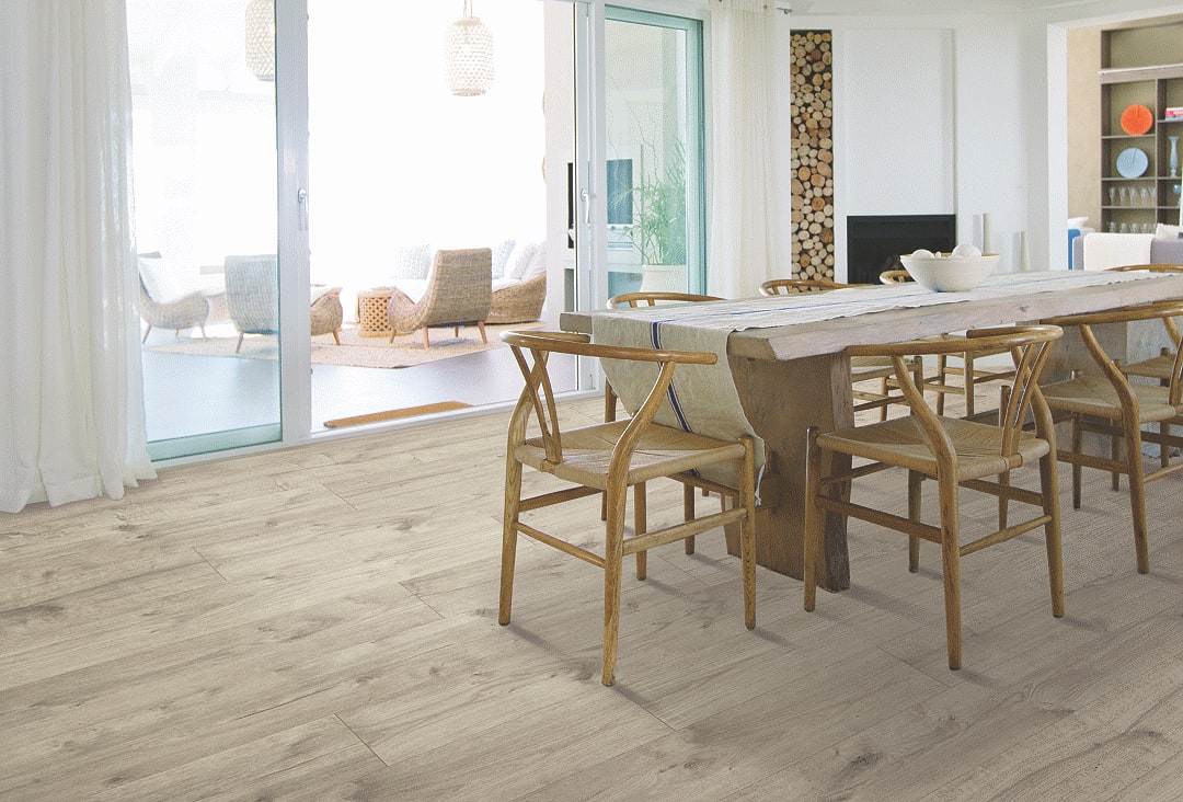
Airy Aesthetics - Light-colored wood flooring such as white, whitewashes or light gray are a great foundation for any space. Does your room receive ample amounts of natural light? Use this brightness to your advantage. If you paint your walls white, off-white, pastel yellow, or pastel pink, you will have a perfect pairing to create an ethereal atmosphere. For an ombre effect, try painting the top portion of your wall with your favorite pastel and the lower half of your wall with a darker, saturated complementary color.

Navigating Neutrals - If you decide to go with a neutral-colored wood look, you are setting yourself up for long term versatility when it comes to matching color trends. In fact, this shade will match deep hues and pastels with equal attractive effectiveness. You can make the room completely dynamic with bold colorful accents like eye-catching artwork, a brilliant vase or other striking decorative pieces.
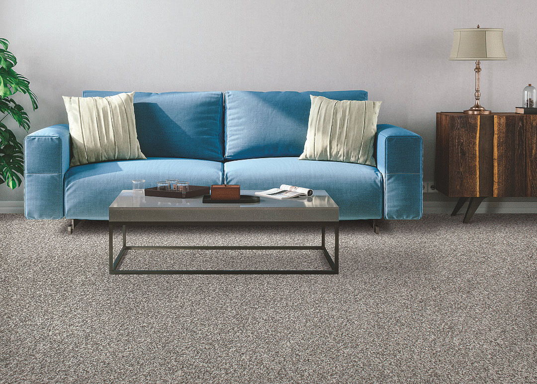
Carpet Color - If you love the warm texture and utter comfort that cozy carpet provides, use the latest technological innovations to your advantage. In addition to brilliant carpet colors and exceptional clarity, Mohawk SmartStrand ColorMax carpet uses multi-tonal yarn for gorgeous blends that easily mix with nearly every décor, shade and other flooring types in the home. These versatile yarns will also match a wide range of paint samples, which makes coordinating wall colors even easier. To match the rest of the hard surfaces in your home, ColorMax blends are specifically designed to complement the natural color variations found in stone and wood floors.
In the end, it’s all about staying true to yourself and the vision you love for your home. When brainstorming new color combinations, don’t be afraid to consider all possibilities. Your next design refresh might be your favorite color scheme yet!


